
Trader Containers is a global reseller of intermodal shipping containers that has been in business longer than any of its peers. Its 200+ locations worldwide enable Trader to quickly and easily service customers ranging from container dealers and logistics firms to the military and national governments.
Challenge: Despite its history, broad capabilities and impressive market presence, Trader’s logo, web site and collateral materials didn’t adequately reflect the brand’s forward-thinking, forward-moving attitude or its estimable strengths.
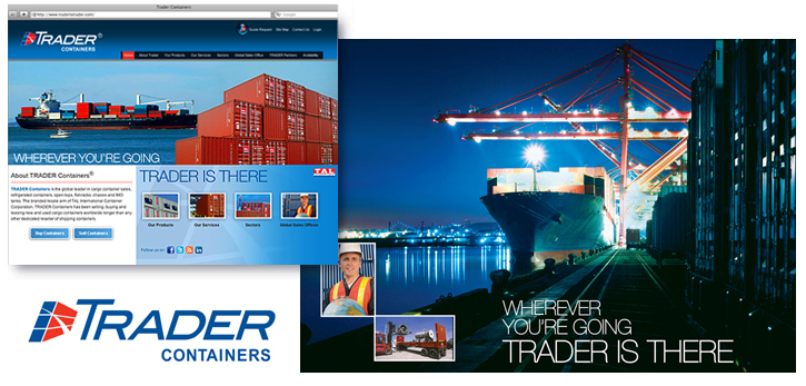
Solution: Believing the best brand identities communicate clearly on multiple levels, we created the tagline, Wherever You’re Going, Trader is There, to emphasize three things – the company’s global presence; its capacity to serve customers relative to various forms of transportation (maritime, rail, truck); and the fact that it “got there first,” outpacing its competition. We developed Trader Containers’ new logo, featuring a stylized container whose configuration expresses rapid movement, superimposed by longitude and latitude lines that suggest the company’s international abilities. The logo was the launch point for a fresh, updated look for all of the company’s visual components, including its web site, trade show graphics, presentation templates and trade advertising.

For more than 40 years, Artisan Field has helped businesses communicate effectively through evolving visual media. A multi-disciplinary graphic design and marketing communication firm, Artisan Field has attracted a diverse client base, ranging from start-up businesses to Fortune 500 corporations across multiple industries worldwide.