
Texas Bay Credit Union (TBCU) is a well-established, full-service credit union that has been serving members through multiple Houston-area branches since 1936. Over the past five years, TBCU has experienced considerable growth in loans, deposits and assets. But, as the credit union added new branches and started more aggressively marketing to younger prospective members, it realized its branding did not reflect its progress or appeal to the desired 18-34 year old age demographic.
Challenge: As part of a marketing effort to attract younger members while continuing to serve core members, TBCU rebranded itself with the short-cut name its members were already using: Texas Bay. To support the rebranding, the credit union needed an updated logo, compelling tagline and responsive website redesign.
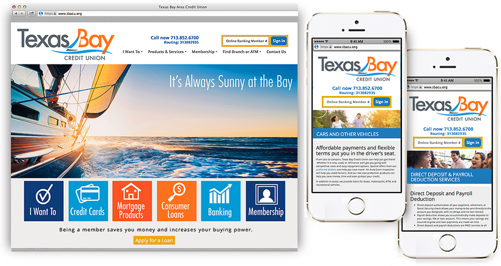
Solution: Our marketing team conducted a comprehensive assessment of TBCU’s business that included interviews with executives and staff as well as a global review of market and customer data. Based upon that insight, we created a distinctive logo that incorporates a stylized sailboat motif to emphasize the ‘bay’ connection and establish how TBCU makes banking smoother and easier. To further support that association, we developed the tagline, It’s Always Sunny at the Bay. Finally, we designed and produced an upbeat, easy-to-navigate, interactive website in a fresh and modern color palette.

For more than 40 years, Artisan Field has helped businesses communicate effectively through evolving visual media. A multi-disciplinary graphic design and marketing communication firm, Artisan Field has attracted a diverse client base, ranging from start-up businesses to Fortune 500 corporations across multiple industries worldwide